Guidelines for the Preparation and Presentation of Papers for a LECTURE SESSION:
So you are going to present a paper at the EPE’23 ECCE Europe-Conference in Aalborg…
… Congratulations! In the European professional power electronics world it is considered an honour to have a paper accepted by the international selection committee for presentation at the 25th European Conference on Power Electronics and Applications.
… and good luck, since you are of course eager to get your ideas across to your colleagues arriving from more than 40 countries, who are prepared to learn from your experience.
A good presentation requires some preparation. Much of the preparatory work will focus on small details. But do not underestimate the time this will take … and the results.
These notes have been written for your help. Do not discard these unless you are definitely sure that you have already used all the ideas in the author’s checklist.
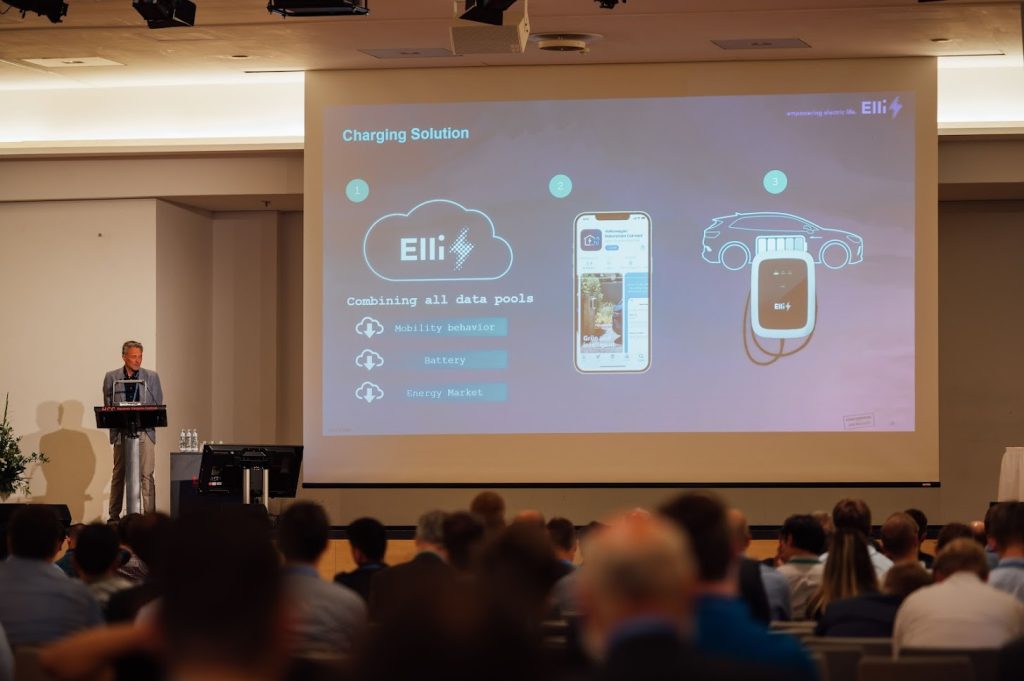
A “slide” in the following text is normally a page of a Power Point presentation or a PDF presentation with a multimedia projector.
1. Author’s Checklist
a) At Home:
- Write your paper according to the rules given in the Author’s Kit
- Prepare slides according to the suggestions given in the paragraph “Preparation of slides”
- Do not use too many formulas, and keep them simple
- Try out the presentation in front of an audience or with a camcorder:
- use the slides;
- ask for feedback regarding the level of your presentation;
- have the language checked if you are not using your mother-tongue;
- be aware of the time limit of 15 minutes.
b) Before the Session:
- Meet the session chairmen
- Inspect the lecture hall and its facilities:
- projection equipment;
- lights;
- pointer;
- microphone.
c) At the Session:
- Speak slowly and as simply as possible;
- Stick to the time limit.
2. Preparation at home
You will certainly want slides to be made. Remember that the preparation of slides takes (a lot of) time.
Follow the guidelines given in the paragraph 5 “Preparation of slides”. It may mean the difference between delivering a successful presentation or a rather incomprehensive presentation.
Keep slides simple, both diagrams and formulae. Make sure that the slides really fit the text as spoken. Don’t use the illustrations from the written paper as slides. Generally they require significant time to understand.
A poor slide is not better than no slide at all: it is far worse than no slide at all. A poor slide will embarrass the audience and later embarrass you!
Someone will have the courage to tell you!
Avoid the use of too many slides: 10 is quite a lot, 20 may affect the timing of your 15 minutes presentation.
There is a great difference between “writing” and “reading” a paper as far as the contents are concerned. The reading of a “written paper”, or of parts of it, hardly ever gives satisfactory results. A written paper is usually compact, providing a relatively high density of detailed information, exact formulation and derivation or formulae. Little redundancy is allowed, but literature references and cross-references are permitted. If, however, for some reason “reading” a text is unavoidable, e.g. because of language difficulties, then this text should be specially prepared with a view to oral presentation.
In an oral presentation the speaker has the opportunity to present his information in a conversational style. By far the best way is to discuss the topics using only a set of notes containing the essential points, instead of reading a text.
It is a good idea to make these notes on a set of cards as used in card files. In order for the lecture to begin smoothly and for you to reach a clear conclusion, completely write out the opening and the closing sentences. Elsewhere, try to suffice with short notes.
Remember: you are the expert in the room on the topic that you are going to discuss.
A lecture ought to contain three parts:
- The introduction, stating explicitly the topic of the lecture (perhaps 3 minutes);
- The main body;
- The conclusions, summarising the lecture (perhaps 3 minutes).
The total amount of time allocated per lecture will be 15 minutes, plus 5 minutes time for discussions. Because of time limits only main topics can be treated; they should be in an easily understandable – not very mathematical – form.
For derivations of formulae and less important details one should refer to the proceedings; as in an oral presentation the introduction of the terms, definitions and symbols may be relatively lengthy, in order for the audience to become familiar with them (the listener cannot look back as it is the case when reading a written contribution).
It is far better to treat a few subjects in a clear and comprehensible way than many subjects in a hurry. As the proceedings have been distributed among the participants, authors should certainly not try to present the full text of their papers. They should concentrate rather on a short formulation and motivation of the problem being discussed and on the obtained results.
After these preparations you should feel confident about presenting your work. The only thing that remains to be done is to try out the presentation (including the use of slides) with some co-workers and on a camcorder. If you will speak in a language that is not native to you, then try to get some feedback on that aspect too. For example, mispronunciations (e.g. “angel” instead of “angle”) may spoil the whole performance.
Be aware of the time limit. It requires much skill (or training and self-discipline) to stick to the allocated time. The session chairmen will advise you to come to an end, and if necessary, will stop your presentation.
3. Preparations just before the Session
It is highly recommended that the speaker meets the session chairmen about 10 minutes before the start of the lecture session.
You should meet in your lecture hall, details of which will be provided in the printed programme !
Familiarise yourself with the environment and the technical equipment:
- Slides projection
- Microphone
- Pointer
- Lights
4. At the Session
An author should be present in person at the conference, otherwise his paper will not be presented, not be discussed and not be uploaded into the IEEE Xplore database.
Please make sure that the presenter has made himself known on the host before the conference:
https://wd.cborg.info/EPE2023/ → “I will be a speaker”.
See to it that your time-table is strictly adhered too. It is impolite to cause other lecturers to have insufficient time, because you have used up too much. None of the lecturers want to speak to a tired audience. Allow sufficient time for the slides. Please move over to the conclusions if the chairman warns you that your time is up.
One has to appreciate the fact that at an international conference most listeners use another language than the speaker. Therefore one should speak slowly and as simply as possible, with much more clarity than in written papers.
Do not circulate handouts or display models during the lecture as this diverts attention. Experience has shown that objects circulated in a lecture lose their relevance as the talk progresses.
When projecting a picture, explain its meaning (e.g. the co-ordinates and parameters) before you continue your lecture. Do not expect the audience to try to understand the picture while you are already talking about conclusions or even other topics.
5. Preparation of Slides
a) Effect of Slides:
Good slides are an effective tool in holding an audience’s attention, and in clarifying and amplifying the verbal message.
Bad slides have the opposite effect: they distract and irritate the audience. It is discourteous to project slides that cannot be read or understood by viewers in the rear seats. It is, however, easy to make better slides by keeping to a few simple rules that are presented and explained further down below.
b) Dimension of Slides:
For the EPE’23 ECCE Europe-Conference we are concerned only with Power Point- or PDF presentations. Please use the landscape layout.
c) Delivering your Presentation:
Your Power Point- or PDF presentation is to be sent through the following website:
https://wd.cborg.info/EPE2023/ → “Upload Presentation”
The last deadline to receive the presentation(s) is Wednesday, the 30th of August 2023.
The size limit of your file is 6 MegaByte.
Please meet our local team at the media check room. (open daily from 8 am until 4 pm) where the file will be tested and copied on the local PC, in order to ensure that the presentation will run smoothly without set-up waiting time. Transparencies are no longer allowed. Please be present ten minutes before the lecture session starts and make sure to bring a reserve copy on USB.
The laptops used in the lecture sessions are PC compatible and they will have a fresh and basic installation of at least Windows 10.
For displaying PDF presentations, Adobe Reader will be used.
Please remember to embed the fonts to secure a correct display.
At least Microsoft Office 2016 / Powerpoint 2016 will be used for PowerPoint presentations.
Please save your presentation as a PowerPoint presentation (.ppt), not as a PowerPoint show (.pps).
Movies are only supported using the default codecs from a fresh Windows 10 installation.
- Video playback problems can be caused by very long file names for video files. There is a 128 character limit on the total path length of the video file, e.g. C:\DocumentsandSettings\User\MyDocuments\Lectures\Powerpoint\BSAVA2013\FinalFinal\Bloodpressureinthepostoperative.wmv. This example is around 115 characters, and demonstrates this potential problem
- Windows Media Video (.wmv file extension) is a Microsoft proprietary format and therefore the compatibility with PowerPoint should be very good.
- It is advisable that you avoid supplying presentations in PowerPoint 2010 format, particularly in the (then new) feature that allows files to be EMBEDDED in the presentation (meaning that the files do not need to be transported separately) as opposed to the traditional method of INSERTING videos (where the video must be provided separately to the presentation). While PowerPoint 2007 appears to support this feature, and it does provide a more fail-safe way of ensuring that all required videos are present, it is unclear whether potential issues will be raised by the large file sizes associated with video files.
As a backup, please have your presentation available on a USB stick or for download from an internet website.
We are sorry we cannot support Apple keynote and Open Office Impress presentations.
d) Principles of Good Slides:
– Clarity of ideas
A good slide conveys a single, significant message to support the oral presentation.
Several simple slides are more effective than one complicated slide.
– Simplification
It is usually advantageous to simplify all tables, graphs, diagrams and drawings. Reduce lines and wording to a bare minimum. Supplementary information may be presented orally.
Graphs are better than tables. Tables require interpretation and are recommended only if the presentation cannot be portrayed graphically.
– Size references
A photograph should generally include some object of known size to show dimensions, particularly if the size of the item on display is of interest and if the main object does not give any clue. A few examples: a person, a head, a hand, a fingertip, a matchbox, a pencil, or a millimeter-grid graph paper as a background.
– Lay-out
If possible, the artwork should be planned with such proportions that the net picture area is efficiently utilised. There is no necessity of placing a company’s or university’s logo on every slide as this will consume precious space.
– Critical use of illustrations
When reproducing material from printed publications, check their suitability according to our principles, and use only unfolded and unwrinkled originals for the best results. In most cases even good illustrations cannot be used because they contain too many details.
– Text legibility
The font should be concise, with sufficiently large letters (height about 2.5 – 3.0 % of picture width). Limit each table (or tabulation) to about 25 words or data. Spacing between words and lines should be more ample than in ordinary printed text.
– Formulae and equations
When formulae and mathematical equations are used they should be limited to a few lines. Not more than one hundred letters, symbols and figures should be used on one slide.
– Colour
Colour slides are highly effective. Colour can be used in graphs, diagrams, etc …, to clarify and direct attention to areas that might be lost in black and white.
– Duplicate
Plan to duplicate slides if one particular slide is to be shown more than once. This will reduce the confusion in hunting the slide when it reappears on the slide listing.
Template:
Click HERE to download a PowerPoint-template for your Lecture Session presentation.
Please note: You are free to use this template, but you are definitelly not obliged to use it.
If all presenters use the same template, the lecture sessions get visually monotonous.
To upload your presentation, please go to:
https://wd.cborg.info/EPE2023/
Click “Upload Presentation” and follow the procedure
To make yourself known as the presenter, please go to:
https://wd.cborg.info/EPE2023/
Click “I will be a speaker” and follow the procedure
Contacts:
EPE’23 ECCE Europe
C/o AAU Energy
Francesco IANNUZZO
Pontoppidanstraede 111
9220 Aalborg East
DENMARK
Tel: +45 9940 3314
E-mail: epe2023@aau.dk
EPE Association
C/o Vrije Universiteit Brussel – IrW – ETEC
Philippe Hamacher
Pleinlaan 2, Boulevard de la Pleine
BE – 1050 Brussels
BELGIUM
Phone: +32 (0)470 65 79 90
E-mail: Philippe.Hamacher@vub.be

